This section covers the following features:
Example of a Template in the E-signature Viewer
The following example shows a template displayed in the main e-signature viewer:
Main Toolbar
The following example shows the Main Toolbar:

Pan
The following example shows the Pan icon:

Signature
The following example shows the Signature icon:

When you click on the Signature button, the following items are displayed:
- Required Checkbox - select the checkbox to require the end user to fill in the field
- Field ID - this field is populated with a generic name by default
- Display Name - enter a name to easily recognize the field
Initials
The following example shows the Initials icon:

When you click on the Initials button, the following items are displayed:
- Required Checkbox - select the checkbox to require the end user to fill in the field
- Field ID - this field is populated with a generic name by default
- Display Name - enter a name to easily recognize the field
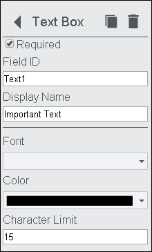
Text Box
The following example shows the Tex Box icon:

When you click on the Text Box button, the following items are displayed:
- Required Checkbox - select the checkbox to require the end user to fill in the field
- Field ID - this field is populated with a generic name by default
- Display Name - enter a name to easily recognize the field
- Font Drop-down - click to select from a list of available fonts
- Color Drop-down - click to select from a list of available colors
- Character Limit - enter a number to limit the number of characters a user can enter
Date
The following example shows the Date icon:

When you click on the Date button, the following items are displayed:
- Required Checkbox - select the checkbox to require the end user to fill in the field
- Field ID - this field is populated with a generic name by default
- Display Name - enter a name to easily recognize the field
- Font Drop-down - click to select from a list of available fonts
- Color Drop-down - click to select from a list of available colors
Checkbox
The following example shows the Checkbox icon:

When you click on the Checkbox button, the following items are displayed:
- Required Checkbox - select the checkbox to require the end user to fill in the field
- Field ID - this field is populated with a generic name by default
- Display Name - enter a name to easily recognize the field
Icons, Buttons & Fields
Unnamed Template Field
The following example shows the Unnamed Template Field:

- Unnamed Template Field - click to enter the name of the template you are designing
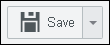
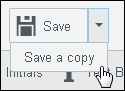
Save Button
The following example shows the Save Button / Drop-down:
- Save Drop-down - click to Save or Save a Copy of the template:
Zoom In / Zoom Out
The following example shows the Zoom In / Zoom Out Toolbar:

- Minus Sign - click to zoom out
- Percentage - displays the viewing percentage
- Plus Sign - click to zoom in
Page Navigation
The following example shows the Page Navigation Toolbar:

- First Page - click to go to the first page of the template
- Previous Page - click to go to the previous page
- Next Page - click to go to the next page
- Last Page - click to go to the last page of the template
Form Fields Pane
- After you add some fields to the template, you will see them displayed in the Form Fields Pane to the right of the template:

- You can sort the Form Field names so the proper tab order is created for signing. Click on the arrows (highlighted in blue below) to activate the sorting feature. Click on the bars (highlighted in yellow below) to drag the Form Field name up or down in the list:

After you have moved the fields as desired, click on the arrows again to de-activate the sorting feature.
- You can easily modify the fields from this pane by clicking on the Display Name of the field. For example, click on Signature of Examiner to edit that field:

- The Signature Pane displays and you can edit the contents of this pane as desired. The Duplicate icon, highlighted in yellow below, allows you to draw multiple signatures at a time. To delete a signature field in the template, click on the Delete button, highlighted in green below:

Form Field Secondary Pane
The following example shows the Form Field Secondary Pane (which displays when you click on an item in the Form Field Pane):
Note that the following items are available in the Form Field Secondary Pane depending on the tool you selected on the main toolbar - Signature, Initials, Text Box, Date, Checkbox:
- Required Checkbox - select the checkbox to require the end user to fill in the field
- Field ID - this field is populated with a generic name by default
- Display Name - enter a name to easily recognize the field
- Font Drop-down - click to select from a list of available fonts
- Color Drop-down - click to select from a list of available colors
- Character Limit - enter a number to limit the number of characters a user can enter

